V.
zest

Typography II
Newsletter Publication
Theme: Health Food
Name of Newsletter publication: Zest
I’ve named my publication Zest which has two meanings; firstly it means the grated skin of citrus fruits, it also means enthusiasm. I wish to show the excitement I have for creating and eating healthy food through my magazine.
Issue 1: Smoothies
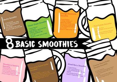
There are 3 articles in this issue, “benefits of smoothies”, “an interview with Ami Shoesmith" and “8 basic smoothies” respectively.
Getting there...
This is the cover and back page of my initial design.
I was exploring the placement of the title of the magazine, hence I had it on the side instead of the usual top.
Next to it is the subtitle, which is a pun that I intend to have for every issue to catch viewers’ attention.
The graphic was simply a person holding a smoothie cup, which can be seen as serving the cup or smoothie to someone else, or the person him/herself is drinking the smoothie.
The back cover is a message I wish to spread about healthy eating and the graphic is just repeated patterns
Comments by instructor and class:
-
The blue colour is not an appetizing colour
-
The smoothie cup looks too plain
-
There can be a better placement for the title
-
The hierarchy of the text on the first page is not clear enough.
-
The back cover is too messy
-
The patterns are nice but is distracting
-
The quote can be better organized
-
There is no need for a barcode
-
It was good that I drew out a quote that I wanted viewers to pay attention to.
-
Titles are placed in an interesting manner
Draft 2
Hence, after the consultation, I’ve changed the layout, colors, graphics, and text of the newsletter
Here are some comments given during critique:
-
The background is now less distracting, but the text is not well aligned to the grids and columns, hence looking messy.
-
Graphics can be more well placed within the spread
-
The title is not obvious enough
-
The graphics are too big, hence distracting.
-
It is good that there is a clear distinction between the questions and answers, however, the placement of each question looks very haphazard
Final Newsletter
Next issue
Newsletter is about longetivity


Final Thoughts
Through this journey of creating a newsletter, I’ve learned the graphic and text synergy, how colours, weights and sizes of text and graphic blend well with each other on a spread and is not overpowering something else.
Not forgetting what I’ve learnt in Assignment 1, with the help of column and grids, I’m able to manage a big chunk of text into a neat and readable passage that is engaging as demonstrated in page 2-3
Also, with the help of Assignment 2 where I learn break the grids, this can be seen in page 4-7. Breaking the grids give the text lots of energy and enthusiasm, which reflects the title of the magazine, zest.
Finally, the back cover resembles the cover page, which symbolises the start of a new issue that will be coming soon in the following month. This magazine has longevity and as the creator, I wish to always put up articles that bring food and health to readers with zest and love!
Assignment 1 - Designing black and white poster

Assignment 2 - Designing coloured poster

Thank you Professor Angeline Yam for this exciting project! I was able to work on a theme I was passionate about and draw bright and energetic graphics


